Projector
Monitor
Lighting
Digital Display
Job References
This site uses cookies. By continuing to browse the site you are agreeing to our use of cookies, you can also manage preferences.
This site uses cookies. By continuing to browse the site you are agreeing to our use of cookies, you can also manage preferences.
Projector
Monitor
Lighting
Digital Display
Job References
Projector
Monitor
Lighting
Digital Display
Job References
Knowledge Center SupportIn any professional workflow, consistency is key, and this is especially true when working with images. Designers and editors of photography, graphics and video must ensure the color, contrast, sharpness, luminance and saturation are consistent from camera to canvas, from software to screens, and perhaps most importantly, from imagination to delivery.
At some (or most) stages of this workflow you’ll be staring at an LCD monitor or two. So will your collaborators, your project managers, your producers and your client. If you’re designing a campaign using PANTONE Color of the Year as your theme, it is crucial that everyone’s monitor reproduces Living Coral (Pantone 16-1546, by the way) as Living Coral. Everyone needs to see “An animating and life-affirming coral hue with a golden undertone that energizes and enlivens with a softer edge.”

Not red, not orange, not hot pink or tummy upset medicine pink, but the distinctive hue that would make Jacques Cousteau proud.
Now, that might sound like a bit of a personal question, but it has to be asked. You want the best color, don’t you? Trust us, we have your best interests at heart.
Color gamut is a measurement of the various levels of colors that can potentially be displayed by a device. As we mentioned in our Color Space 101 Knowledge Center post, there are actually two types of color gamuts, additive and subtractive.
Additive refers to the color that is generated by mixing together colored light to generate a final color. This is the style used by computers, televisions and other devices. It is more often referred to as RGB based on the red, green and blue light used to generate the colors. In additive color, R, G and B combine to make white.
Subtractive color is used by mixing together inks or dyes to prevent reflection of light. By controlling what wavelengths of light are reflected from a surface, the desired color is produced. Subtractive color is used for all printed media such as photos, magazines, and books. The primary colors of this model are cyan, magenta and yellow. The more these colors are blended, the further away from white you go. According to subtractive color theory, mixing equal intensities of red, green and blue result in black. The problem with that theory, however, is you don’t get black. It’s more of a dark brown. To compensate for this, a fourth color is added, K, to C, M and Y to become CMYK and deliver true blacks in printing.

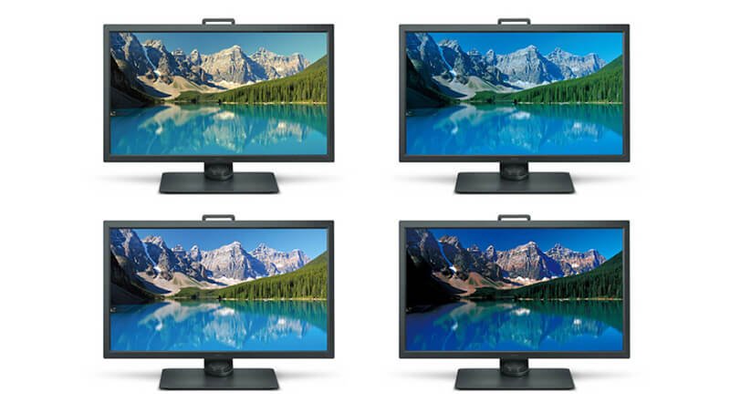
Below is a colorful scene displayed on four different monitors.
The original RAW camera image is the same on all four, yet there are variations in the color gamuts the monitors reproduce. The monitor in the lower left corner shows greenish water while in the lower right the water appears bluer. Colors in the upper right monitor appear more saturated than in the upper left.
Depending upon your monitor, you may see other differences, and therein lies the point.

What’s crucial here is, in a truly color-accurate workflow, all 4 monitors should look exactly the same.
Below is another example. Looking at the monitors from left to right and right to left, you can see a lot of variations in what they display. We’d all like to think that electronics should exhibit the same colors, especially with devices with the same make and model.
Wouldn’t that be nice?
What’s the deal?

When you put the same image on two monitors side-by-side, you have at least a 95% of chance that the images will not look the same. That’s a real problem when color matters most.
The three main contributors to monitor inconsistencies are: 1) The color gamut favored by different manufacturers; 2) the fundamental differences between additive color mixing (light-emitting devices like monitors and TVs) and subtractive color mixing (inks and dyes and printing); and 3) mass production (quality control).
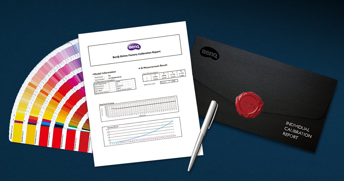
BenQ monitors are equipped with the latest color standards, Display P3 and DCI-P3, to guarantee a consistent color application among all designers. As more apps, devices and websites adopt the color space of Display P3, BenQ monitors are ready, enabling design professionals to effortlessly load and display images imported from different sources. Additionally, BenQ monitors cover 96% of DCI-P3, as well as 100% sRGB, 99% Adobe RGB and 100% Rec. 709 color space, utilizing the advanced IPS wide viewing angle technology to minimize color shift to inspire absolute design confidence. What’s more, BenQ monitors feature an industry-leading “out of the box” color accuracy, and an individual calibration report is provided with every BenQ monitor.

No matter your place in the digital imaging workflow, BenQ has a monitor for you.
Thanks for your feedback!